What Are You Doing this Pi Day?
 Global gourmet?
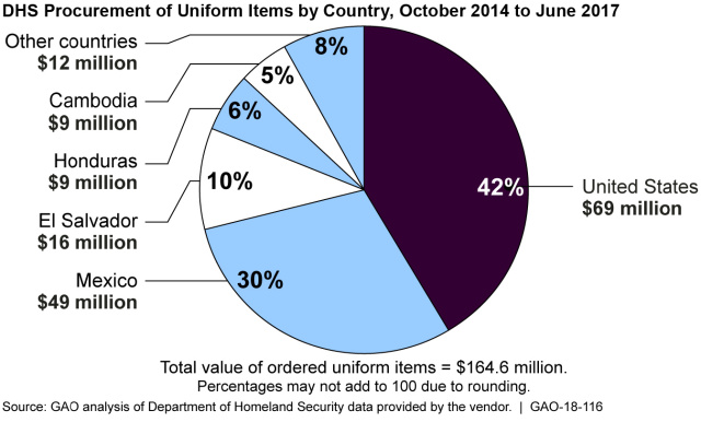
This pie chart from our report on government procurement shows that when it comes to procuring DHS uniforms, it’s an international “recipe.”
 Divvying up the pie
The pie charts in our America’s Fiscal Future collection show some of the largest categories of government spending and revenue and depict the scale of action that would need to be taken to close the fiscal gap—the difference between program spending and revenue. (Sample our interactive pie charts on our webpage.)
 Comparing one pie to another
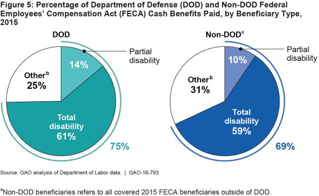
DOD civilian employees who get hurt on the job are covered under the Federal Employees' Compensation Act program, which works to return injured employees to work and provides compensation for work-related disabilities. These pie charts in our report show how DOD’s cash payments to beneficiaries compared to other federal agencies in 2015.
Banking may not be as easy as...
Banks are increasingly closing their branches along the U.S./Mexico border—due in part to increased money laundering risks and because of banks’ efforts to comply with federal anti-money laundering requirements. The pie charts in our report on banking regulations show the magnitude of bank closures in 3 border communities—which may lead to decreased services for residents and businesses.
 A closer look at that slice of pie
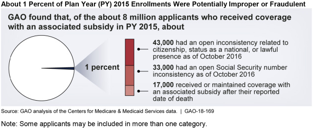
The Affordable Care Act helps subsidize health-care coverage for qualifying applicants. But the pie chart in our report on enrollments in this subsidy program shows that a small percentage—about 1 percent—were potentially improper or fraudulent in 2015. What makes up that 1 percent?

- Questions on the content of this post? Contact Chuck Young at youngc1@gao.gov.
- Comments on GAO’s WatchBlog? Contact blog@gao.gov.

GAO's mission is to provide Congress with fact-based, nonpartisan information that can help improve federal government performance and ensure accountability for the benefit of the American people. GAO launched its WatchBlog in January, 2014, as part of its continuing effort to reach its audiences—Congress and the American people—where they are currently looking for information.
The blog format allows GAO to provide a little more context about its work than it can offer on its other social media platforms. Posts will tie GAO work to current events and the news; show how GAO’s work is affecting agencies or legislation; highlight reports, testimonies, and issue areas where GAO does work; and provide information about GAO itself, among other things.
Please send any feedback on GAO's WatchBlog to blog@gao.gov.


