The Evolution of GAO Graphics
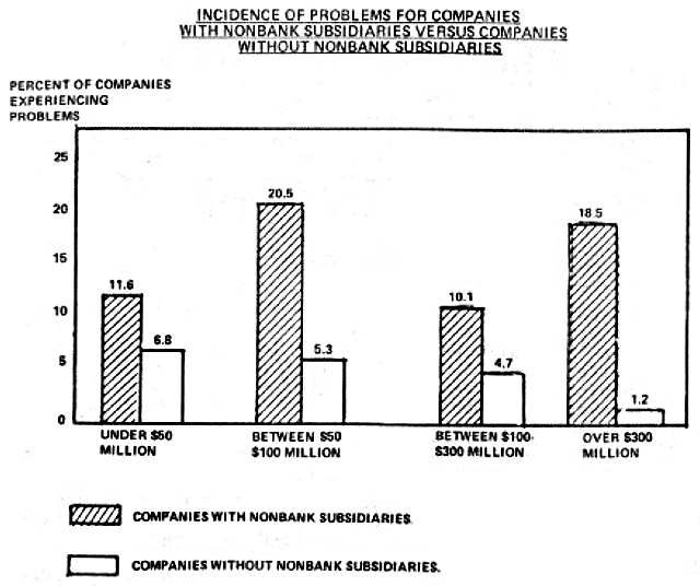
Excerpted from GGD-81-79
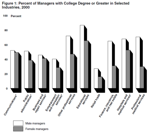
The Comptroller General at the time, Charles Bowsher, introduced a visual standards manual intended to standardize the look of GAO printed products across divisions. This manual influenced the look and feel of today’s GAO graphics, as you can see in the example below with the heavy black line above the figure title, and the typefaces used. These changes were intended to ensure the accuracy and clarity of our graphics. A feature introduced in the standards manual that is no longer required is the drop shadow—the black partial border that gives boxes and bars a three-dimensional feel.Excerpted from GAO-02-648T
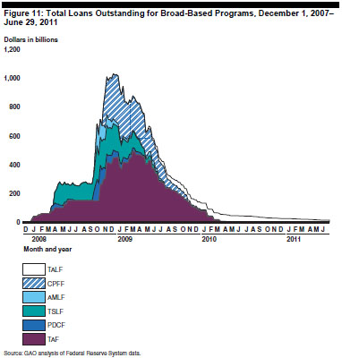
2000 to Today To respond to our clients’ needs and concerns about resources and costs, we moved from a print publishing model to a PDF/online model. Once we didn’t have to worry about the printing costs of using color, we were able to use it more often and to greater effect. In 2010, we started using a standard color palette. See the graphic below on total loans outstanding for an idea of how color can be used to compare multiple data sets.Excerpted from GAO-11-696
We also began using interactive graphics in our report PDFs during this period. Explore the interactivity of the graphic below by downloading this report: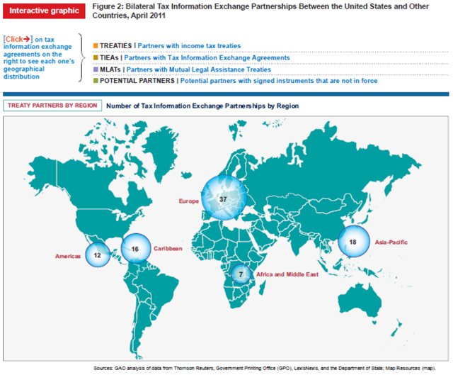
Excerpted from GAO-11-730
In recent years, we have been producing more reports than ever. Our graphics staff has grown in size and broadened its capabilities to meet this demand. As a result, we have been able to make more customized graphics, including original illustrations, interactive PDF graphics, and single figures that combine multiple types of data graphics. Check out this example of an original illustration:
Excerpted from GAO-14-237
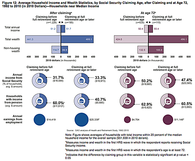
In the example below, you can see how the sliding bar charts and pie charts work together to give a more complete picture of Social Security, income, and wealth:Excerpted from GAO-14-311
As we go forward, we’re moving toward more web-based interactive graphics, such as the ones on this page about the federal debt. We have also published several infographics, such as this one about Duplication and Cost Savings in the federal government. Check out more than 1,000 GAO graphics on our frequently-updated Flickr page.- Questions on the content of this post? Contact Chuck Young at youngc1@gao.gov.
- Comments on the WatchBlog? Contact blog@gao.gov.

GAO's mission is to provide Congress with fact-based, nonpartisan information that can help improve federal government performance and ensure accountability for the benefit of the American people. GAO launched its WatchBlog in January, 2014, as part of its continuing effort to reach its audiences—Congress and the American people—where they are currently looking for information.
The blog format allows GAO to provide a little more context about its work than it can offer on its other social media platforms. Posts will tie GAO work to current events and the news; show how GAO’s work is affecting agencies or legislation; highlight reports, testimonies, and issue areas where GAO does work; and provide information about GAO itself, among other things.
Please send any feedback on GAO's WatchBlog to blog@gao.gov.

